You may have noticed that things look a little different around here. We’re over the moon to introduce you to our new CJ branding! We’ve refreshed our visuals to better reflect our culture, values, and innovation.
The result of our efforts showcases our distinct voice and contemporary aesthetic without straying from our roots. To express our personality, we pushed our brand elements to speak (loudly) for themselves. We curated a fresh color palette, implemented a unique (yet timeless and functional) font family, and designed dynamic graphic elements. But, in order to stand out, we’re invoking deeper visual connections—our new design integrates a symbolic visual story that expresses the core of our affiliate marketing ecosystem.

Read on to learn more about our brand, the intention behind each element, and see some eye-catching examples of our new design in action.
What Makes Us CJ: Our Brand Pillars
We started by leaning into our core beliefs—the things that have always made us, well—CJ. The four pillars of our brand are the foundation of everything we do as a company and are the underpinnings of our visual identity:
- Cutting-edge tech that lets our clients focus on what matters most: growth.
- Data that changes the conversation. If you have a question, we can answer it.
- We’re experts. We do what’s right, not what’s easy.
- Big community. Real connections.
While we have a vast offering of innovations, these are core themes in everything we have done and continue to do. As a company, we work with data, technology, analytics, numbers, and figures and this dimension is central to our identity and solutions. Equally important is the human element. We’re a group of passionate people helping other people—we’re curators of connection, and we support our clients in finding success.
Although these things form the backbone of our brand, we’re also—dare we say—a little fun. Our refreshed design puts our exciting and energetic side on display and shows that we’re both an intelligent, innovative force and approachable and fresh.
Our Visual Story
At our core, CJ helps people build meaningful connections. These connections create a robust network, and this network provides growth and opportunities for advertisers and publishers. We developed a graphic system to visually tell this story. These symbols will be used throughout CJ’s marketing to better illustrate who we are and what we do.
The story begins in a familiar place—with our brandmark—and continues from there.
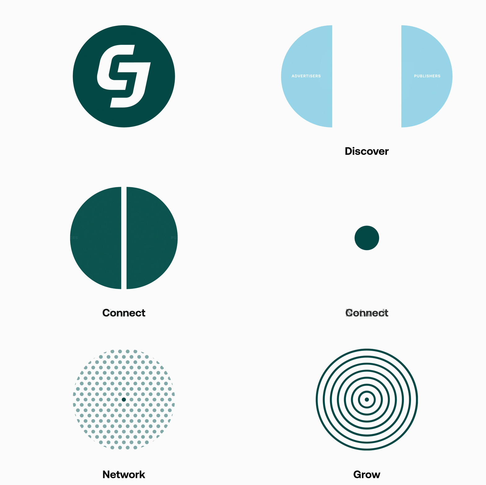
Discover: Advertisers and publishers are depicted in their simplest form through a single half-circle—not only representing individual entities, but also the opportunity between the two.
Connect: CJ revolves around meaningful connections. Advertisers and publishers come together to form a beneficial relationship that is visually represented by a full circle that personifies connection.
Network: The collection of circles illustrated a system of interconnected advertisers and publishers and visually represents the CJ network.
Grow: Concentric circles radiate outwards from a full circle—a partnership—visually representing expansion and symbolizing growth.
Our Colors
Color is wildly important to brand recognition as it’s one of the first visual connections you make with a brand. Our aim with our color choices was to move into a contemporary space without losing the essence of how CJ has historically looked and felt.
CJ Green
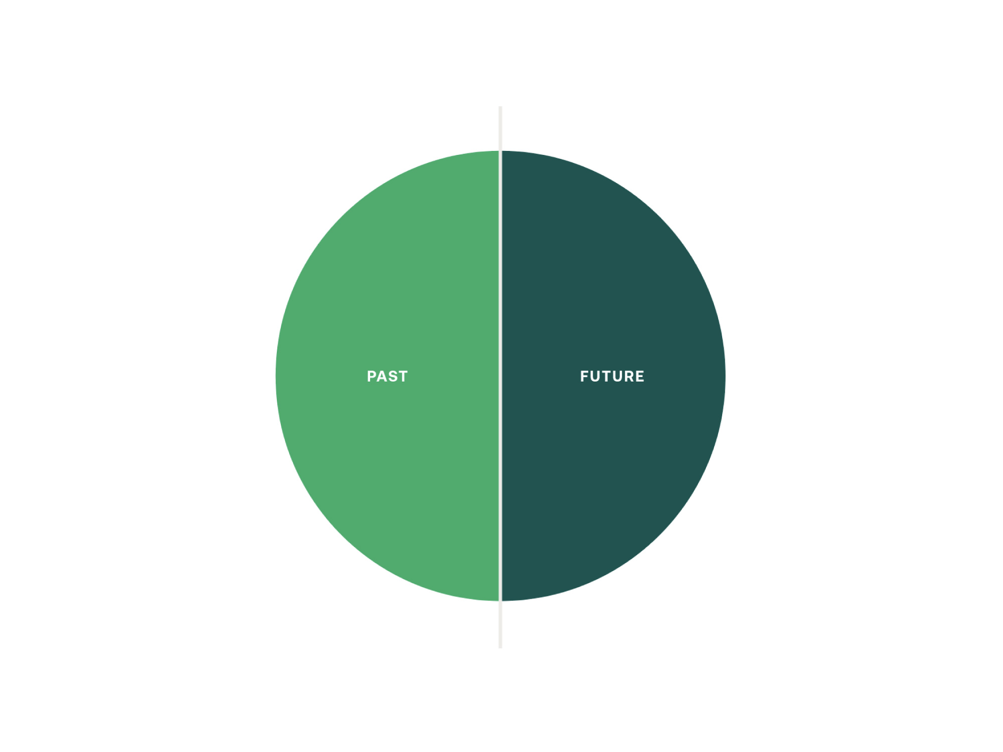
Green is in our heritage. In the not-so-distant past, CJ was represented by a vibrant Kelly green. In keeping with our roots, we’ve shifted towards a deep green that evokes intensity while simultaneously feeling safe and trustworthy. This color selection allows us to move into a more natural color space without sacrificing recognition, effectiveness, or professionalism.
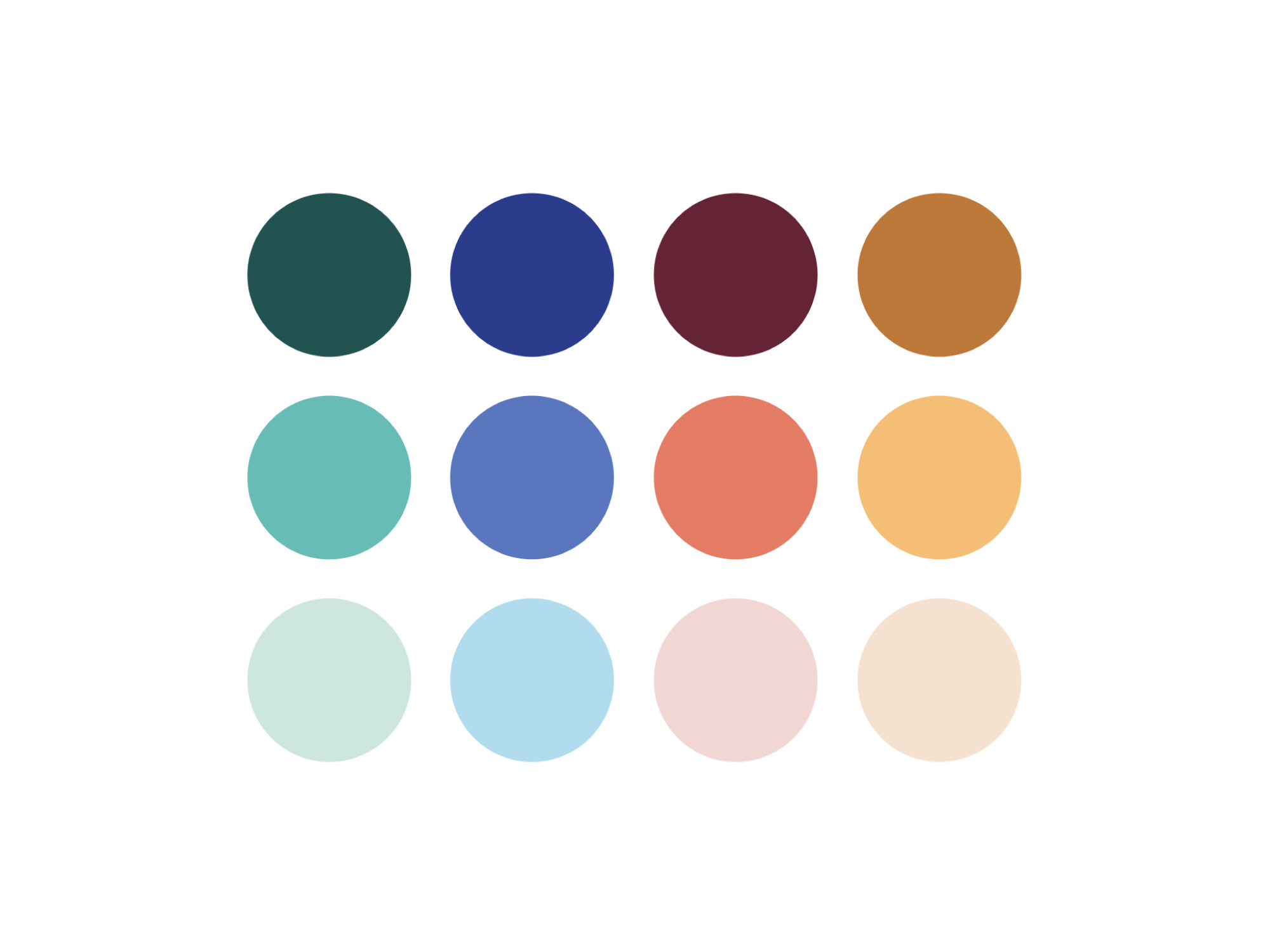
Full Palette
Our full color palette features tonal range and vivid hues without feeling artificial or unnatural. Our intention was to diverge from what could be described as the stereotypical tech industry aesthetic: high saturation, exaggerated hues, and intense contrast. Instead, we set out to create a stronger association with colors you’d engage with in everyday life for a more human connection.
You may have noticed that the teal in the center-left has been used widely in previous branding. Even though we’re moving into a more contemporary vibe, we’re taking a piece of CJ history with us.
Our Logo

When we first opened our doors in 1998, we showed our big personality and commitment to lead with a bold, 90’s lime green. As we continue to innovate and adapt, so does our green. We’re using our new, deep green for our primary logo.
We also refined the logo slightly by rounding the edges and taking some weight out of the lines to give it a modernized feel without losing our well-earned recognition.
Our Typography
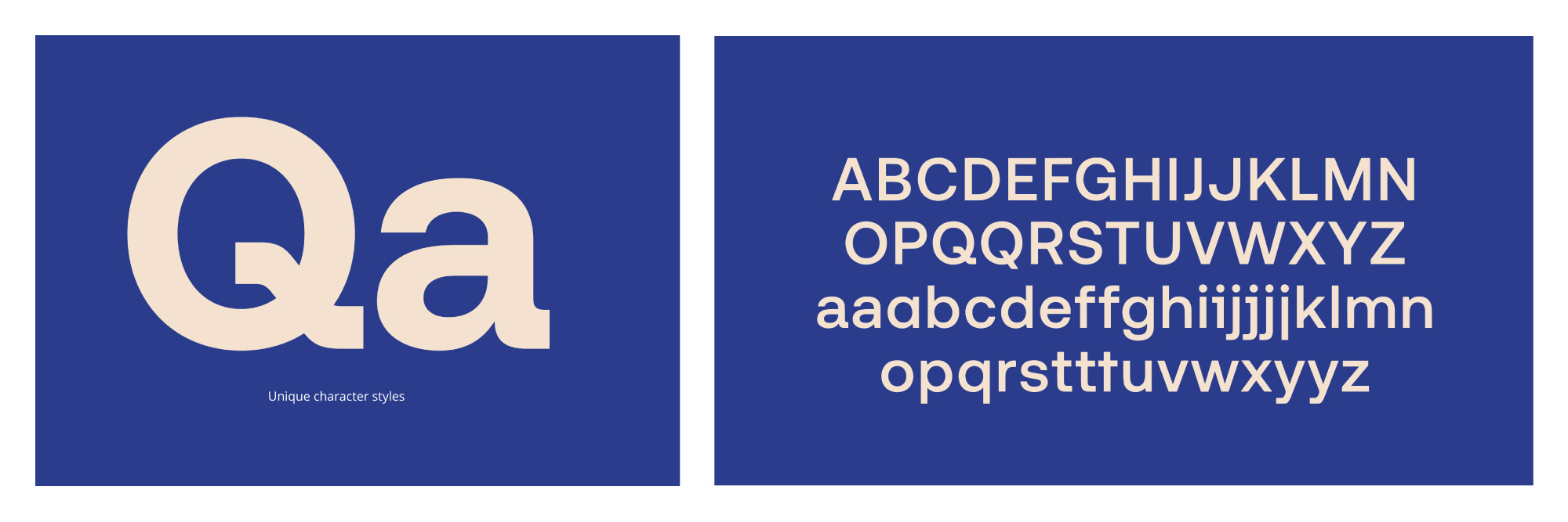
Our new font family is modern and filled with personality, yet timeless. As a brand, we aim to have a real, authentic connection with you, and we believe that typography is an essential part of that. Our font features a hybrid of distinct characters and geometric structure, allowing for complete legibility and functionality with a unique flair.
Mockups
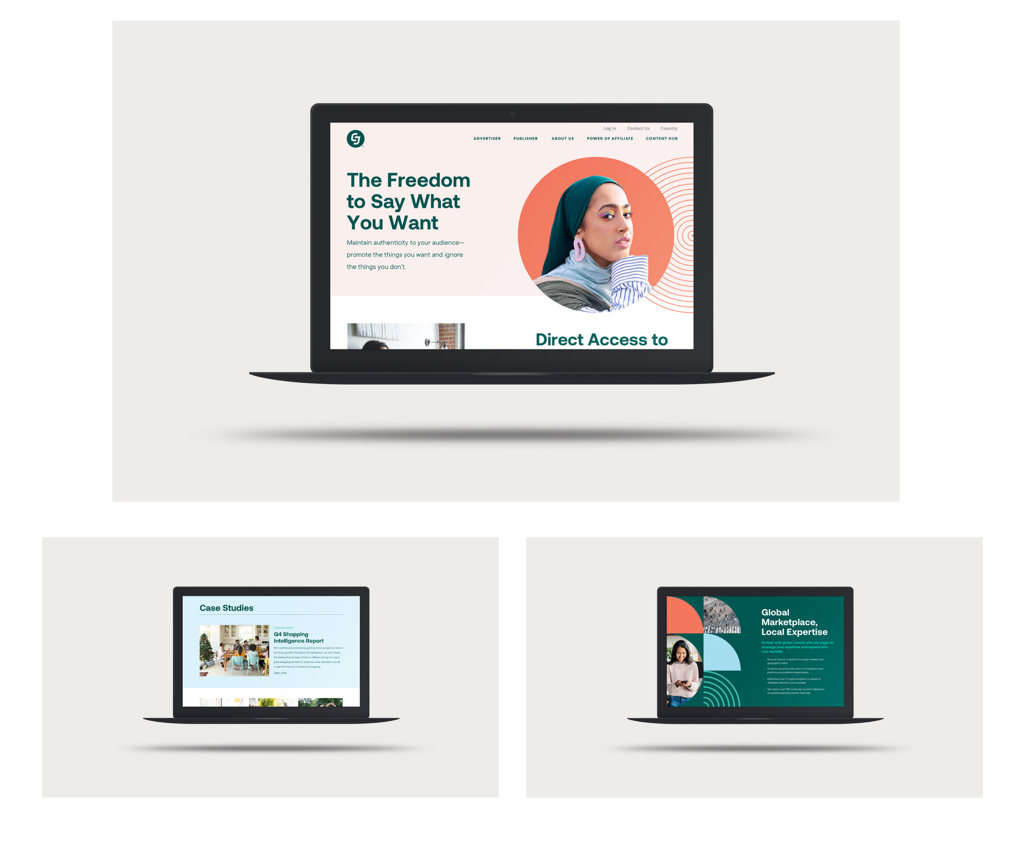
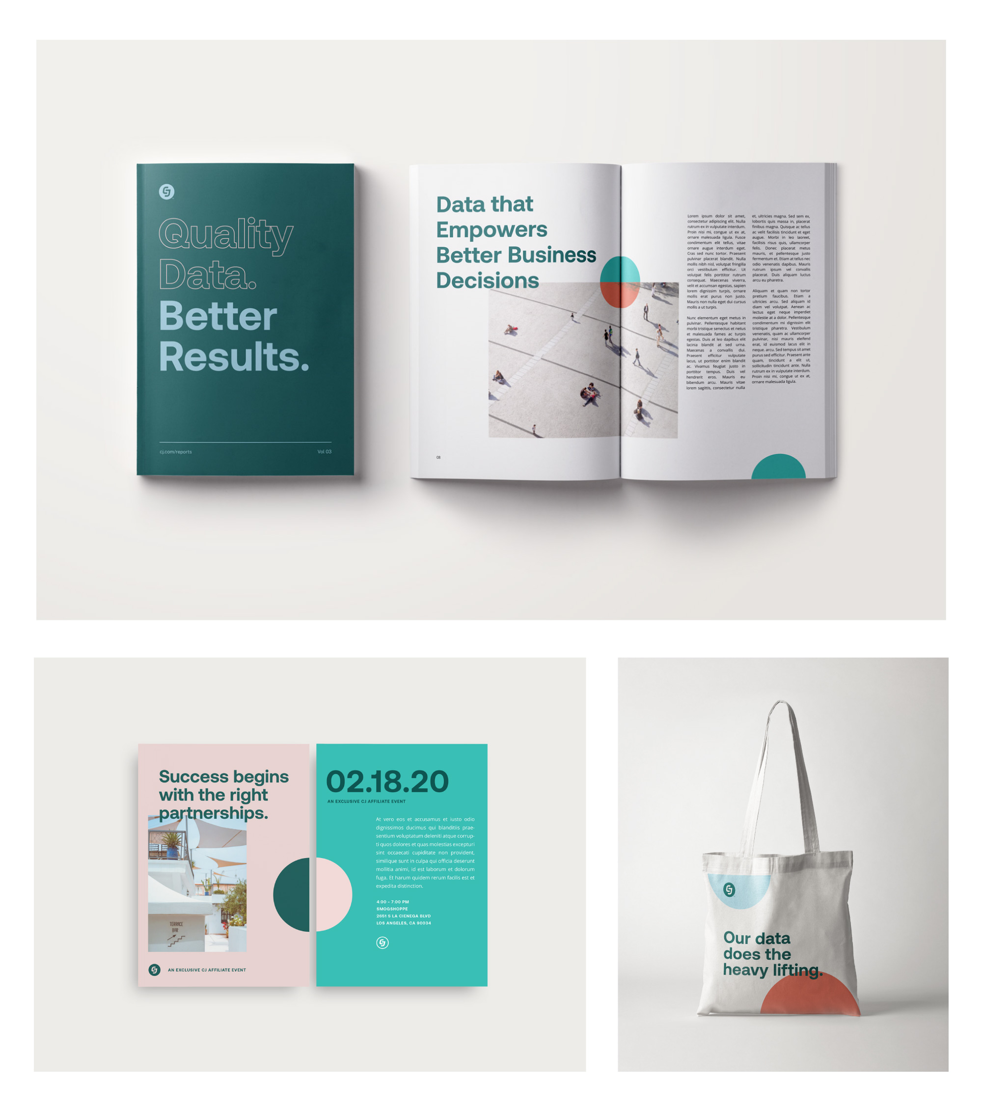
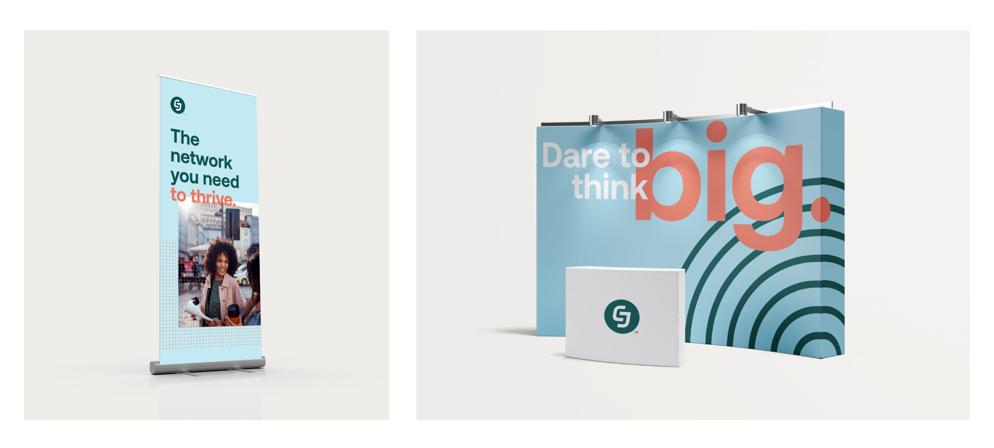
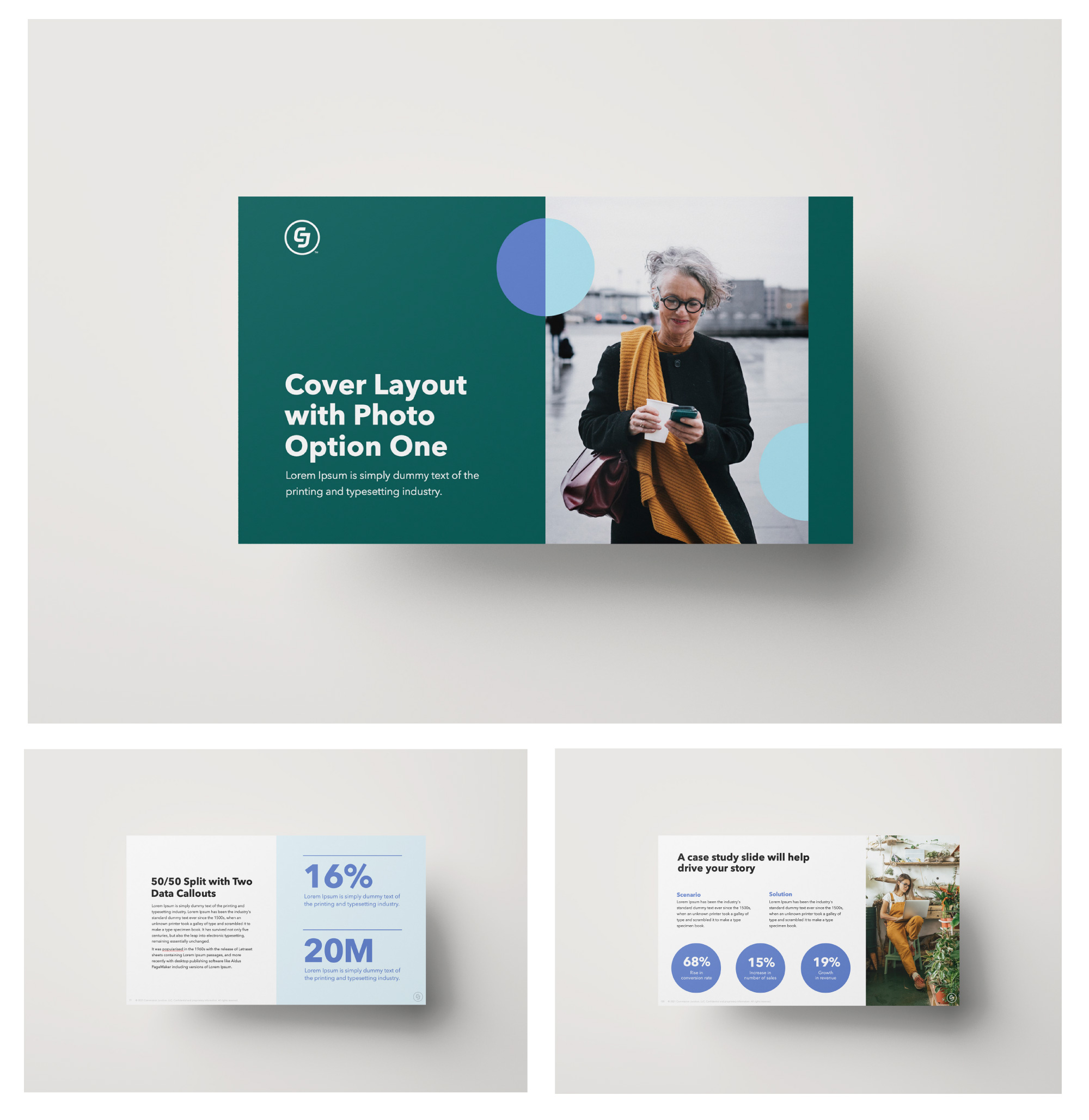
How do all these elements come together? Here are some mockups so you can visualize how our new branding might take shape in the wild.
Website
Event Swag & Invitation
Event Signage
Presentation Decks
We hope you love the new brand look as much as we do! 💗


Share